标签搜索


搜索到
12
篇与
的结果
-
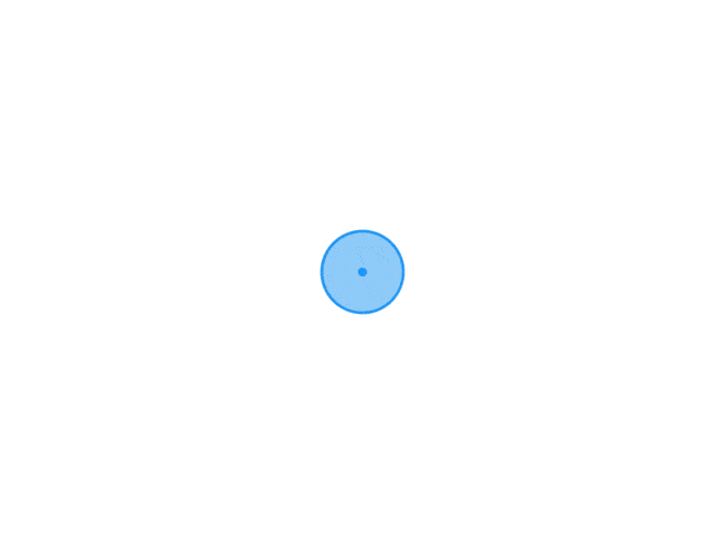 css 背景渐变色用法案例 下面给你一份「纯 CSS 渐变色背景」速查手册 + 10 个可直接复制的小案例,涵盖最常用场景:线性、径向、锥形、多色、动画、文字遮罩、边框、按钮、卡片、星空。所有代码均「零依赖」,粘进 <style> 就能玩。0. 语法 5 秒速记/* 线性 */ background: linear-gradient(角度或方向, 颜色1 停点1, 颜色2 停点2, ...); /* 径向 */ background: radial-gradient(形状 大小 at 位置, 颜色1 停点1, ...); /* 锥形(IE 不支持) */ background: conic-gradient(颜色1 停点1, ...);1. 清爽对角线(卡片常用).diagonal-soft { background: linear-gradient(135deg, #667eea 0%, #764ba2 100%); }2. 双色分割 Banner(上下 50%).split-banner { background: linear-gradient(to bottom, #ff9a9e 50%, #fecfef 50%); }3. 径向聚光灯(按钮 hover).radial-btn { background: radial-gradient(circle at 50% 50%, #f6d365 0%, #fda085 100%); transition: .4s; } .radial-btn:hover { background-size: 150% 150%; /* 放大制造动感 */ }4. 多色条纹(进度条 or 彩蛋).rainbow-stripe { background: repeating-linear-gradient( 45deg, #ff006e 0px 10px, #8338ec 10px 20px, #3a86ff 20px 30px, #06ffa5 30px 40px ); }5. 锥形渐变仪表盘(IE 不支持).conic-wheel { width: 200px; height: 200px; border-radius: 50%; background: conic-gradient( red 0deg 60deg, orange 60deg 120deg, yellow 120deg 180deg, green 180deg 240deg, blue 240deg 300deg, purple 300deg 360deg ); }6. 文字渐变填充(mask 法).gradient-text { background: linear-gradient(90deg, #f093fb 0%, #f5576c 100%); -webkit-background-clip: text; -webkit-text-fill-color: transparent; background-clip: text; text-fill-color: transparent; }<h1 class="gradient-text">Hello Gradient</h1>7. 渐变边框(border-image).gradient-border { border: 4px solid transparent; border-image: linear-gradient(45deg, #12c2e9, #c471ed, #f64f59) 1; }8. 悬浮光晕按钮(伪元素 + 动画).glow-btn { position: relative; z-index: 1; background: linear-gradient(45deg, #2193b0, #6dd5ed); border: none; color: #fff; padding: 12px 28px; overflow: hidden; } .glow-btn::before { content: ""; position: absolute; inset: 0; background: linear-gradient(45deg, #ff006e, #8338ec, #3a86ff, #06ffa5); z-index: -1; opacity: 0; transition: opacity .4s; } .glow-btn:hover::before { opacity: 1; }9. 动态流动背景(纯 CSS 动画).animated-flow { background: linear-gradient(-45deg, #ee7752, #e73c7e, #23a6d5, #23d5ab); background-size: 400% 400%; animation: flow 8s ease infinite; } @keyframes flow { 0% { background-position: 0% 50%; } 50% { background-position: 100% 50%; } 100% { background-position: 0% 50%; } }10. 星空粒子(径向随机小圆).starry-night { background: radial-gradient(ellipse at top, #1b2735 0%, #090a0f 100%), radial-gradient(2px 2px at 20px 30px, #eee, transparent), radial-gradient(2px 2px at 40px 70px, #fff, transparent), radial-gradient(1px 1px at 90px 40px, #fff, transparent), radial-gradient(1px 1px at 130px 80px, #fff, transparent), radial-gradient(2px 2px at 160px 30px, #ddd, transparent); background-size: 200px 100px; background-repeat: repeat; }11. 一行代码「超柔光」背景(Shopify 卡片最爱).soft-light { background: linear-gradient(120deg, #fdfbfb 0%, #ebedee 100%); }12. 小技巧合集需求写法让渐变「固定」不随滚动background-attachment: fixed;渐变加透明度rgba(255,0,0,0.6) 或 #ff000099重复渐变repeating-linear-gradient(...)控制色标位置linear-gradient(90deg, red 20%, blue 80%)多层叠加用逗号分隔:background: url(img.png), linear-gradient(...);把上面 class 直接贴到元素就能看效果,改颜色、角度、停点即可快速拼出你自己的品牌渐变。祝玩得开心!
 -
-
-
css 滚动条优化问题 假设最外层容器命名为outer,那么特定的这个区域滚动条的优化如下: .outer { width: 200px; height: 200px; border: 1px solid red; display: block; overflow-x: scroll; /* Enable scroll for the y-axis */ overflow-y: hidden; /* Disable scroll for the x-axis */ } .inner { height: max-content; /* Use max-content or a fixed height */ width: max-content; /* Use max-content or a fixed width */ } /* 整个滚动条 */ .outer::-webkit-scrollbar { width: 5px; /* 设置滚动条的宽度 */ height: 5px; /* 设置滚动条的高度 */ } /* 滚动条轨道 */ .outer::-webkit-scrollbar-track { background: #f1f1f1; /* 设置轨道的背景颜色 */ } /* 滚动条的滑块 */ .outer::-webkit-scrollbar-thumb { background: #fc9a41; /* 设置滑块的背景颜色 */ } /* 当鼠标悬停在滑块上 */ .outer::-webkit-scrollbar-thumb:hover { background: #fc9a41; /* 设置滑块在悬停状态下的背景颜色 */ } <div class="outer"> <div class="inner"> test content </div> </div>
-
shopify 增加youtube视频和选项卡 引入相关资源<link rel="stylesheet" href="https://unpkg.com/element-ui@2.15.13/lib/theme-chalk/index.css"> <script src="https://cdn.shopify.com/s/files/1/0607/1861/2695/files/vue.min.js"></script> <script src="https://cdn.shopifycdn.net/s/files/1/0136/3119/3188/files/elementui-index.js"></script>sun-tab-video-css style liquid<style> * { margin: 0; padding: 0; box-sizing: border-box; } [v-cloak] { display: none; } @media (min-width: 1200px) { #shopify-section-header-08 .container, #shopify-section-navigation-08 .container { width: 1400px; } } .sun-video { width: 80%; margin: 50px auto; } .sun-video .video-group { display: flex; justify-content: space-between; margin: 10px 0; flex-wrap: wrap; } .sun-video .video-item { width: calc(100% / 3 - 10px); margin-top: 20px; } .sun-video .video-group:after { content: ""; display: block; width: calc(100% / 3 - 10px); height: 0; } .sun-video .video-title { display: -webkit-box; font-size: 20px; font-weight: bold; margin: 30px 0; text-align: center; min-height: 50px; overflow: hidden; text-overflow: ellipsis; -webkit-line-clamp: 2; line-clamp: 2; -webkit-box-orient: vertical; } .sun-video .video-content { width: 100%; text-align: center; } .sun-video .video-content:hover .play-button { background: #f00; } .sun-video .youtube { background-color: #000; margin-bottom: 30px; position: relative; padding-top: 56.25%; overflow: hidden; cursor: pointer; } .sun-video .youtube img { width: 100%; top: 0; left: 0; opacity: 0.8; } .sun-video .youtube img[data-class='default'] { top: -40px; } .sun-video .youtube .play-button { width: 90px; height: 60px; background-color: #000; box-shadow: 0 0 30px rgba(0, 0, 0, 0.6); z-index: 1; opacity: 0.8; border-radius: 6px; } .sun-video .youtube .play-button:before { display:block; content: ""; border-style: solid; border-width: 15px 0 15px 26.0px; border-color: transparent transparent transparent #fff; } .sun-video .youtube img, .sun-video .youtube .play-button { cursor: pointer; } .sun-video .youtube img, .sun-video .youtube iframe, .sun-video .youtube .play-button, .sun-video .youtube .play-button:before { position: absolute; } .sun-video .youtube .play-button, .sun-video .youtube .play-button:before { top: 50%; left: 50%; transform: translate3d(-50%, -50%, 0); display:block; } .sun-video .youtube iframe { height: 100%; width: 100%; top: 0; left: 0; } .sun-video .main-container-img img { width: 100%; } @media (max-width: 1000px) { .sun-video { width: 95%; } .sun-video .video-item { width: 100%; margin: 10px auto; } } @media (min-width: 1600px) { } </style> <style> .el-tabs__nav { width: 100%; } .el-tabs__item { padding: 0; width: calc(100% / {{ section.settings.tab_count | default: 2 }}); text-align: center; /*border-left: 1px solid #ccc;*/ /*border-top: 1px solid #ccc;*/ /*border-right: 1px solid #ccc;*/ /*border-bottom: 0;*/ } .el-tabs__item.is-active { color: #e71c20; } .el-tabs__active-bar { background-color: #e71c20; /*bottom: auto;*/ } .el-tabs__item:hover { color: #e71c20; } .el-tabs--card > .el-tabs__header .el-tabs__item.is-active { border-top: 2px solid #e71c20; } </style> <div class="sun-video" id="sun-video-app" v-cloak> <el-tabs id="sun-video-tab-content" v-model="activeName" @tab-click="handleClick" type="card"> </el-tabs> </div>html section {% if customer.id or true %} {% if section.settings.render_first %} {% render 'sun-tab-video-css' %} {% endif %} {% if section.settings.tab_title == blank %} <style> .el-tabs--card>.el-tabs__header{display:none;} </style> {% endif %} <div id="{{ section.id }}" style="display:none;"> {% if section.settings.tab_title %} <el-tab-pane label="{{ section.settings.tab_title }}" name="{% if section.settings.render_first %}first{% else %} {{ section.id }}{% endif %}"> {% endif %} <div class="video-group"> {% for block in section.blocks %} <div class="video-item"> <p class="video-title">{{ block.settings.title }}</p> <div class="video-content"> <div class="youtube" data-embed="{{ block.settings.embed_id }}" data-max="{{ block.settings.max }}"> <div class="play-button"></div> </div> </div> </div> {% endfor %} </div> {% if section.settings.tab_title %} </el-tab-pane> {% endif %} </div> <script> window.sunshine.tab_html = $('#{{ section.id }}').html(); $("#sun-video-tab-content").append(window.sunshine.tab_html) </script> {% if section.settings.render_last %} {% render 'sun-tab-video-js' %} {% endif %} {% endif %} {% schema %} { "name": "Sun Tab Video", "settings": [ { "type":"checkbox", "label":"Render First", "id":"render_first", "default": false }, { "type":"checkbox", "label":"Render Last", "id":"render_last", "default": false }, { "type":"number", "label":"Tab Count", "id":"tab_count" }, { "type":"text", "label":"Tab Title", "id":"tab_title" } ], "blocks":[ { "type":"text", "name":"Tab Item", "settings": [ { "type":"text", "id":"title", "label":"Item Title" }, { "type":"text", "id":"embed_id", "label":"Youtube Embed Id" }, { "type":"checkbox", "id":"max", "label":"Thumb Image Max?", "default":true } ] } ], "presets":[ { "name":"Sun Tab Video" } ] } {% endschema %}sun-tab-video-js <script> new Vue({ el: "#sun-video-app", delimiters: ['${', '}'], data: function () { return { activeName: 'first' } }, methods: { handleChange(val) { // console.log(val); }, handleClick(tab, event) { // console.log(tab, event); }, btn_submit() { // console.log('submit') } }, created() { }, computed: {} }) </script> <script> var youtube = document.querySelectorAll(".youtube"); // loop for (var i = 0; i < youtube.length; i++) { var source = ''; var img_class = ''; // thumbnail image source. if (youtube[i].dataset.max == 'true') { source = "https://img.youtube.com/vi/" + youtube[i].dataset.embed + "/maxresdefault.jpg"; img_class = 'max'; } else { source = "https://img.youtube.com/vi/" + youtube[i].dataset.embed + "/0.jpg"; img_class = 'default'; } var image = new Image(); image.src = source; image.setAttribute('data-class', img_class); image.addEventListener("load", function () { youtube[i].appendChild(image); }(i)); youtube[i].addEventListener("click", function () { var iframe = document.createElement("iframe"); iframe.setAttribute("frameborder", "0"); iframe.setAttribute("allowfullscreen", ""); iframe.setAttribute("src", "https://www.youtube.com/embed/" + this.dataset.embed + "?rel=0&autoplay=1&showinfo=1"); this.innerHTML = ""; this.appendChild(iframe); }); } </script>
-
-
jquery shoplazza 投递时间提示代码 <div class="tw-w-full tw-flex tw-items-center tw-mt-4 product-info__marketing-delivery-time {% if section.settings.delivery_time_show_as_date %}product-info__marketing-delivery-time_date{% endif %}" data-delivery-min="{{section.settings.delivery_time_min}}" data-delivery-max="{{section.settings.delivery_time_max}}" > {% include 'icon_sun_shipping',icon_class:"" %} <span class="tw-ml-2 tw-leading-none" > {% if section.settings.delivery_time_show_as_date %} {{ 'i18n.product.product_detail.marketing_delivery' | t: from: "<b></b>",to:"<b></b>"}}{% else %}{{'i18n.product.product_detail.marketing_delivery_days' | t: from: "<b></b>",to:"<b></b>" }} {% endif %} </span> </div><script> $(function () { var $delivery = $(".product-info__marketing-delivery-time"); if ($delivery.length) { var max = $delivery.attr("data-delivery-max"); var min = $delivery.attr("data-delivery-min"); if ($delivery.is(".product-info__marketing-delivery-time_date")) { var maxdate = new Date((new Date()).getTime() + (max * 86400000)); var mindate = new Date((new Date()).getTime() + (min * 86400000)); var formatter = new Intl.DateTimeFormat('en', { month: 'short', day: "2-digit" }); $delivery.find("b").eq(0).html(formatter.format(mindate)) $delivery.find("b").eq(1).html(formatter.format(maxdate)) } else { $delivery.find("b").eq(0).html(min); $delivery.find("b").eq(1).html(max); } } }); </script>
-
-
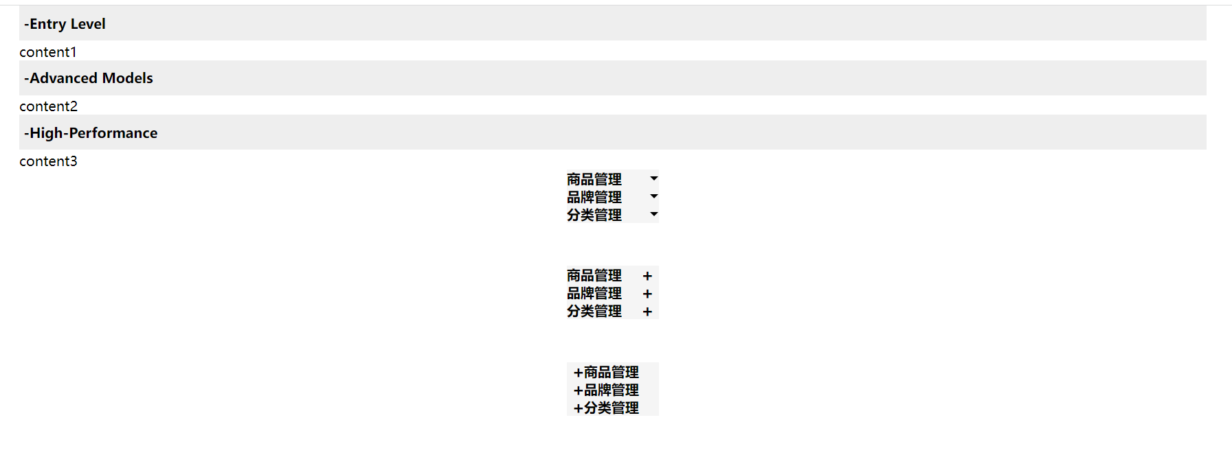
details summary 优化版 案例一<style> * { margin: 0; padding: 0; box-sizing: border-box; } ::-webkit-details-marker { display: none; } ::-moz-list-bullet { font-size: 0; float: left; } </style> <style> #container1 { width: 100%; height: 100%; position: relative; overflow: auto; } #container1 .main { width: 90%; margin: auto; } #container1 summary { outline: none; padding: 10px 5px; cursor: pointer; background: #eee; list-style: none; margin-bottom: 2px; font-weight: bold; display: flex; width: 100%; } </style> <div id="container1"> <div class="main"> <details open> <summary onclick="changeOpen(this)" class="open"> <b>-</b> <span>Entry Level</span> </summary> <div class="compare_content"> content1 </div> </details> <details open> <summary onclick="changeOpen(this)" class="open"> <b>-</b><span>Advanced Models</span> </summary> <div class="compare_content"> content2 </div> </details> <details open> <summary onclick="changeOpen(this)" class="open"> <b>-</b> <span>High-Performance</span> </summary> <div class="compare_content"> content3 </div> </details> </div> </div> <script> function changeOpen(obj) { const b = obj.querySelectorAll('b') console.log(obj.className) if (obj.className == 'open') { obj.className = 'close' b[0].innerHTML = '+'; } else if (obj.className == 'close') { b[0].innerHTML = '-'; obj.className = 'open' } if (obj.className == '') { b[0].innerHTML = '-'; obj.className = 'open' } } </script>案例二<style> #container2 div { width: 7%; margin: 0 auto; text-align: center; } #container2 details { position: relative; background: #f5f5f5; } #container2 summary { font-weight: bolder; cursor: pointer; user-select: none; outline: none; display: flex; position: relative; } #container2 li { border: 1px solid #eee; border-top: 0; list-style: none; } /* 实现动画的原理 */ #container2 summary::after { content: ''; width: 0; height: 0; line-height: 0; font-size: 0; border-left: 5px dashed transparent; border-right: 5px dashed transparent; border-top: 5px solid #000; position: absolute; top: 50%; transform: translateY(-50%); right: 1%; transition: .3s ease-out; } #container2 [open] summary::after { transform: translateY(-50%) rotate(180deg); } #container2 ul { padding: 0; margin-top: 0; transition: .3s ease-out; overflow: hidden; } #container2 [open] + ul { /*max-height: 60px;*/ } </style> <div id="container2"> <div> <details open> <summary>商品管理</summary> <ul> <li>商品列表</li> <li>添加商品</li> </ul> </details> </div> <div> <details open> <summary>品牌管理</summary> <ul> <li>品牌列表</li> <li>添加品牌</li> </ul> </details> </div> <div> <details open> <summary>分类管理</summary> <ul> <li>分类列表</li> <li>添加分类</li> </ul> </details> </div> </div>案例三<style> #container3 { margin-top: 50px; } #container3 div { width: 7%; margin: 0 auto; text-align: center; } #container3 details { position: relative; background: #f5f5f5; } #container3 summary { font-weight: bolder; cursor: pointer; user-select: none; outline: none; display: flex; position: relative; } #container3 li { border: 1px solid #eee; border-top: 0; list-style: none; } /* 实现动画的原理 */ #container3 summary::after { content: '+'; font-size: 20px; /*border-left: 5px dashed transparent;*/ /*border-right: 5px dashed transparent;*/ /*border-top: 5px solid #000;*/ position: absolute; top: 50%; transform: translateY(-50%); right: 6px; transition: .3s ease-in; } #container3 [open] summary::after { right: 6px; font-size: 20px; content: '-'; transition: .3s ease-in; } #container3 summary + .content { height: 0; padding: 0; margin-top: 0; overflow: hidden; width: 100%; transition: height 3s; } #container3 [open] summary + .content { height: max-content; width: 100%; } </style> <div id="container3"> <div> <details open> <summary>商品管理</summary> <div class="content"> <ul> <li>商品列表</li> <li>添加商品</li> </ul> </div> </details> </div> <div> <details open> <summary>品牌管理</summary> <div class="content"> <ul> <li>品牌列表</li> <li>添加品牌</li> </ul> </div> </details> </div> <div> <details open> <summary>分类管理</summary> <div class="content"> <ul> <li>分类列表</li> <li>添加分类</li> </ul> </div> </details> </div> </div>案例四<style> #container4 { margin-top: 50px; } #container4 div { width: 7%; margin: 0 auto; text-align: center; } #container4 details { position: relative; background: #f5f5f5; } #container4 summary { font-weight: bolder; cursor: pointer; user-select: none; outline: none; display: flex; position: relative; padding-left: 20px; } #container4 li { border: 1px solid #eee; border-top: 0; list-style: none; } /* 实现动画的原理 */ #container4 summary::after { content: '+'; font-size: 20px; /*border-left: 5px dashed transparent;*/ /*border-right: 5px dashed transparent;*/ /*border-top: 5px solid #000;*/ position: absolute; top: 50%; transform: translateY(-50%); left: 6px; transition: .3s ease-in; } #container4 [open] summary::after { left: 6px; font-size: 20px; content: '-'; transition: .3s ease-in; } #container4 .content { transition: height 3s; } #container4 summary + .content { height: 0; padding: 0; margin-top: 0; overflow: hidden; width: 100%; } #container4 [open] summary + .content { height: max-content; width: 100%; } </style> <div id="container4"> <div> <details open> <summary>商品管理</summary> <div class="content"> <ul> <li>商品列表</li> <li>添加商品</li> </ul> </div> </details> </div> <div> <details open> <summary>品牌管理</summary> <div class="content"> <ul> <li>品牌列表</li> <li>添加品牌</li> </ul> </div> </details> </div> <div> <details open> <summary>分类管理</summary> <div class="content"> <ul> <li>分类列表</li> <li>添加分类</li> </ul> </div> </details> </div> </div>
-